Home / Blog / Image Translation / Video Translation / Support / Donation / RSS
Lettering Guide for Japanese to English Manga Translation
This article will introduce some lettering tips when translating Japanese manga to English using ImageTrans.
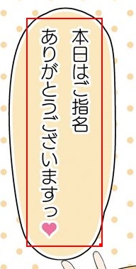
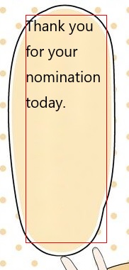
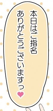
We will use the following bubble for demonstration. The box around the text represents the text area detected by the software.
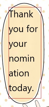
The translated result with auto font size based on the size of the text area:
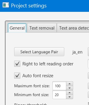
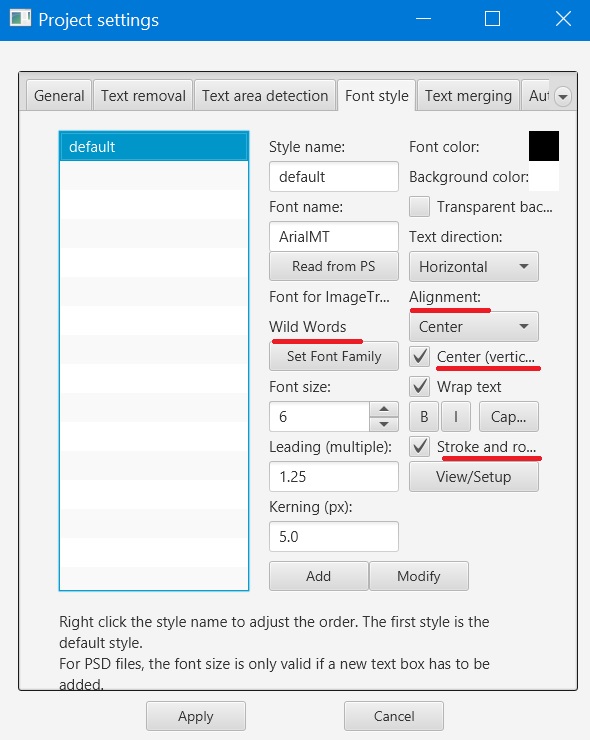
We can set whether to enable auto font size and the range of font size in the project settings:
We can see that because the Japanese text is arranged vertically, the bubble is a rectangular with a large height and a small width. When lettering English, the font size is made too big to meet the height and some words are broken.
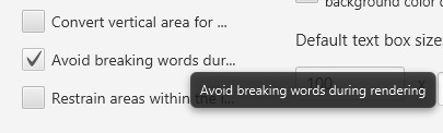
In this case, we can enable the “Avoid breaking words when rendering” option in the project settings (enabled by default after version 2.12.0). It will automatically calculate the required minimum width and adjust the font size, width and horizontal coordinates of the text area.
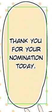
Now, the translated result becomes the following one:
We can see that the text is in the top of the bubble, not in the center. We can add a default font style that enables vertical center alignment. Also, we can set the font, the stroke and horizontal alignment.
After the above adjustments, we can get a good translated result:
The source text has a heart, and we can add it in the target text as well. After typing ♥, use the rich text function to set its color and size.
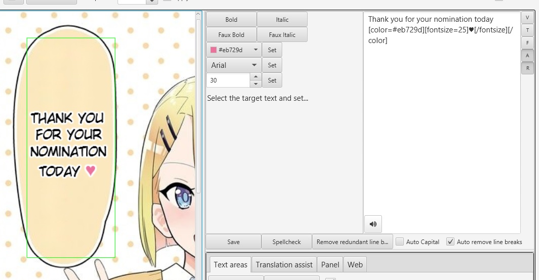
Here is the final translated image.
Original image:
Translated image:

© 2026 BasicCAT ― Powered by Jekyll and Textlog theme